Change Select Option Background-Color on Hover in CSS/HTML
Last updated: Apr 5, 2024
Reading time·5 min
# Table of Contents
- Change Select option Background-Color on Hover in CSS/HTML
- Using an external CSS stylesheet instead
- Using a box shadow to change the Background-Color of an option on Hover
- Styling each option with a different background color on hover
# Change Select option Background-Color on Hover in CSS/HTML
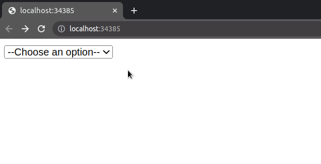
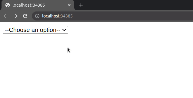
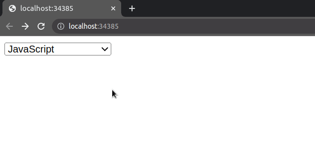
To change the background color of a select option element on hover:
- Set the
onfocusattribute on the element so that all options are shown when the element is focused. - When the element loses focus or an option is selected, change the element's
sizeback to 1. - Set the
background-colorCSS property on the hover state of theoptionelements.
Here is the code for the example.
<!DOCTYPE html> <html lang="en"> <head> <meta charset="UTF-8" /> </head> <style> option:checked, option:hover { background-color: lime; } </style> <body> <select name="languages" id="language-select" onfocus="this.size=6;" onblur="this.size=0;" onchange="this.size=1; this.blur()" > <option value="">--Choose an option--</option> <option value="javascript">JavaScript</option> <option value="typescript">TypeScript</option> <option value="python">Python</option> <option value="java">Java</option> <option value="php">PHP</option> </select> </body> </html>
We set a couple of attributes on the select element.
The onfocus attribute is used to trigger an action when the element receives focus.
When the user clicks on the select element, we set the
element's size
to 6.
<select name="languages" id="language-select" onfocus="this.size=6;" onblur="this.size=0;" onchange="this.size=1; this.blur()" >
option elements in the example, so I used a size value of 6 to display all options without a vertical scrollbar.The size attribute determines the number of rows in the list that should be
visible at one time.
We also set the
onBlur
attribute on the select element.
The blur event is triggered when an element has lost focus.
When the user clicks off, we set the size attribute back to 0, to display
the initial or selected value of the element.
The onchange event is fired when the user selects a different option element.
When the user selects a different option, we set the size attribute to 1 and
then trigger the onBlur event to show the selected option.
The styling in the example is quite intuitive. I've used a style tag to set
the element's
background-color CSS
Property on hover.
<style> option:checked, option:hover { background-color: lime; } </style>
# Using an external CSS stylesheet instead
Alternatively, you can use an external CSS file.
Here is the HTML for the example.
<!DOCTYPE html> <html lang="en"> <head> <meta charset="UTF-8" /> </head> <link rel="stylesheet" href="style.css" /> <body> <select name="languages" id="language-select" onfocus="this.size=6;" onblur="this.size=0;" onchange="this.size=1; this.blur()" > <option value="">--Choose an option--</option> <option value="javascript">JavaScript</option> <option value="typescript">TypeScript</option> <option value="python">Python</option> <option value="java">Java</option> <option value="php">PHP</option> </select> </body> </html>
And here is the related style.css file.
option:checked, option:hover { background-color: lime; }
If I issue the npx serve . command and load the index.html page in my
browser, I can see that everything works as expected.
However, notice that the background color of the selected option element
doesn't change on hover.
# Using a box shadow to change the Background-Color of an option on Hover
If you also need to change the background color of the selected option
element, use the
box-shadow CSS
property.
Here is the HTML for the example.
<!DOCTYPE html> <html lang="en"> <head> <meta charset="UTF-8" /> </head> <style> option:checked, option:hover { box-shadow: 0 0 10px 100px #4ddc3b inset; } </style> <body> <select name="languages" id="language-select" onfocus="this.size=6;" onblur="this.size=0;" onchange="this.size=1; this.blur()" > <option value="">--Choose an option--</option> <option value="javascript">JavaScript</option> <option value="typescript">TypeScript</option> <option value="python">Python</option> <option value="java">Java</option> <option value="php">PHP</option> </select> </body> </html>
The short clip shows that the background color of the selected option is also set.
The box-shadow CSS property usually adds a shadow effect around the element's
frame.
However, if the inset value is set, the shadow is inside the frame of the
element.
As shown in
this section
of the MDN docs, inset shadows are drawn:
- inside the border of an element
- above the background color
- below the content
We specified 5 values when setting the box-shadow CSS property.
<style> option:checked, option:hover { box-shadow: 0 0 10px 100px #4ddc3b inset; } </style>
The values are:
- offset-x - the horizontal distance.
- offset-y - the vertical distance.
- blur-radius - when a larger blur-radius is set, a bigger blur effect is displayed and the shadow becomes larger.
- spread-radius - positive values cause the shadow to expand and negative values cause it to shrink.
- color - the color to be displayed when the user hovers over an
optionelement.
# Styling each option with a different background color on hover
You can use the same approach if you need to style each option element with a
different background color on hover.
<!DOCTYPE html> <html lang="en"> <head> <meta charset="UTF-8" /> </head> <style> option.yellow:hover { box-shadow: 0 0 10px 100px yellow inset; } option.lime:hover { box-shadow: 0 0 10px 100px lime inset; } option.pink:hover { box-shadow: 0 0 10px 100px pink inset; } </style> <body> <select name="languages" id="language-select" onfocus="this.size=4;" onblur="this.size=0;" onchange="this.size=1; this.blur()" > <option value="">--Choose an option--</option> <option class="yellow" value="javascript"> JavaScript </option> <option class="lime" value="typescript">TypeScript</option> <option class="pink" value="python">Python</option> </select> </body> </html>
I set a class on each option element and used the class when setting the
box-shadow CSS property on the elements.
I've also written detailed articles on:
- How to change the background color of an input field in JavaScript
- How to change the background color on click in JavaScript
# Additional Resources
You can learn more about the related topics by checking out the following tutorials:
- Check if Element is Input or Select dropdown in JavaScript
- Change a Button's color onClick using JavaScript
- Change button text on Click using JavaScript
- How to Change Text color on Mouseover in JavaScript
- Add a class to the Clicked Element using JavaScript
- Check if Element was Clicked using JavaScript
- Hide element when clicked outside using JavaScript
- Set min-margin, max-margin, min-padding & max-padding in CSS
- How to adjust a Button's width to fit the Text in CSS
- How to Apply a CSS Hover effect to multiple Elements
- How to set a Max Character length in CSS
- How to bring an element to the Front using CSS
- Apply multiple inline CSS styles to an HTML element
- Force the text in a Div to stay in one Line in HTML & CSS
- justify-self not working in Flexbox issue [Solved]
- CSS text-align: center; not working issue [Solved]
- focus() not working in JavaScript issue [Solved]
- How to set the Width of Select Options in HTML & CSS
- Get all selected values of a multiple Select field in JS
- Tailwind CSS classes not working in Vanilla or React project
- Remove the outline (border) around Inputs & Links in Chrome & Firefox
- How to Limit text length to N lines using CSS [3 Ways]
- Remove whitespace between inline-block elements using CSS
