Remove whitespace between inline-block elements using CSS
Last updated: Apr 5, 2024
Reading time·4 min
# Table of Contents
- Remove whitespace between inline-block elements using CSS
- Remove whitespace between inline-block elements by setting font-size to 0
- Removing the whitespace between elements by using comments
# Remove whitespace between inline-block elements using CSS
When the display CSS property of multiple elements next to one another is set
to inline-block, there is still space between the elements.
<!DOCTYPE html> <html lang="en"> <head> <meta charset="UTF-8" /> <style> #box p { display: inline-block; background-color: lightgreen; padding: 2px 5px; } </style> </head> <body> <div id="box"> <p>bobby</p> <p>hadz</p> <p>com</p> </div> </body> </html>
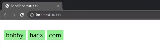
If you need to remove the whitespace between the elements, set the display
property of the container element to flex.
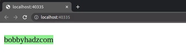
When the parent element's display property is set to flex, the whitespace
between the elements is removed.
<!DOCTYPE html> <html lang="en"> <head> <meta charset="UTF-8" /> <style> #box { display: flex; } #box p { display: inline-block; background-color: lightgreen; } </style> </head> <body> <div id="box"> <p>bobby</p> <p>hadz</p> <p>com</p> </div> </body> </html>
You can wrap the elements in a div and set the
display property on
the div to flex.
The default flex-direction is row, but you can also set the property
explicitly.
#box { display: flex; flex-direction: row; } #box p { display: inline-block; background-color: lightgreen; }
Now there is no whitespace between the inline-block elements.
This also works with images and any other elements.
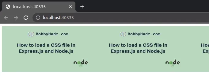
Here is an example without setting the display property to flex on the
container div.
<!DOCTYPE html> <html lang="en"> <head> <meta charset="UTF-8" /> <style> #box img { display: inline-block; width: 300px; height: 150px; } </style> </head> <body> <div id="box"> <img src="https://bobbyhadz.com/images/blog/include-css-file-in-express-and-node-js/thumbnail.webp" /> <img src="https://bobbyhadz.com/images/blog/include-css-file-in-express-and-node-js/thumbnail.webp" /> <img src="https://bobbyhadz.com/images/blog/include-css-file-in-express-and-node-js/thumbnail.webp" /> </div> </body> </html>
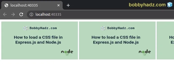
Notice that there is whitespace between the images.
The following example removes the whitespace by setting display to flex on
the wrapper div.
<!DOCTYPE html> <html lang="en"> <head> <meta charset="UTF-8" /> <style> #box { display: flex; } #box img { display: inline-block; width: 300px; height: 150px; } </style> </head> <body> <div id="box"> <img src="https://bobbyhadz.com/images/blog/include-css-file-in-express-and-node-js/thumbnail.webp" /> <img src="https://bobbyhadz.com/images/blog/include-css-file-in-express-and-node-js/thumbnail.webp" /> <img src="https://bobbyhadz.com/images/blog/include-css-file-in-express-and-node-js/thumbnail.webp" /> </div> </body> </html>
# Remove whitespace between inline-block elements by setting font-size to 0
You can also remove the whitespace between inline-block elements by setting the
font-size CSS property to 0 on the wrapper div.
<!DOCTYPE html> <html lang="en"> <head> <meta charset="UTF-8" /> <style> #box { font-size: 0; } #box img { display: inline-block; width: 300px; height: 150px; } </style> </head> <body> <div id="box"> <img src="https://bobbyhadz.com/images/blog/include-css-file-in-express-and-node-js/thumbnail.webp" /> <img src="https://bobbyhadz.com/images/blog/include-css-file-in-express-and-node-js/thumbnail.webp" /> <img src="https://bobbyhadz.com/images/blog/include-css-file-in-express-and-node-js/thumbnail.webp" /> </div> </body> </html>
Notice that we set the font-size CSS property to 0 on the wrapper div
element.
#box { font-size: 0; } #box img { display: inline-block; width: 300px; height: 150px; }
This removes the whitespace between the images.
font-size property to 0 on the parent element and not the nested elements.If you use this approach with elements that contain text, you have to set the
font-size property on the nested elements to override the parent's value.
<!DOCTYPE html> <html lang="en"> <head> <meta charset="UTF-8" /> <style> #box { font-size: 0; } #box p { display: inline-block; font-size: 16px; background-color: lightgreen; } </style> </head> <body> <div id="box"> <p>bobby</p> <p>hadz</p> <p>com</p> </div> </body> </html>

- We set the
font-sizeCSS property on the wrapperdivto0.
#box { font-size: 0; }
- We then set the
font-sizeproperty on the child elements to 16px to override the value that gets inherited from the parent.
#box p { display: inline-block; font-size: 16px; background-color: lightgreen; }
If you don't explicitly set the font-size property on the child elements, then
they will inherit the value from the parent (0) and will be invisible.
# Removing the whitespace between elements by using comments
You can also use comments to remove the whitespace between elements.
<!DOCTYPE html> <html lang="en"> <head> <meta charset="UTF-8" /> <style> #box p { display: inline-block; background-color: lightgreen; } </style> </head> <body> <div id="box"> <p>bobby</p><!-- --><p>hadz</p><!-- --><p>com</p> </div> </body> </html>

Notice that we start a comment on one line and finish it right before the element on the next line starts.
<body> <div id="box"> <p>bobby</p><!-- --><p>hadz</p><!-- --><p>com</p> </div> </body>
The same approach can be used to remove the whitespace between images.
<!DOCTYPE html> <html lang="en"> <head> <meta charset="UTF-8" /> <style> #box img { display: inline-block; width: 300px; height: 150px; background-color: lightgreen; } </style> </head> <body> <div id="box"> <img src="https://bobbyhadz.com/images/blog/include-css-file-in-express-and-node-js/thumbnail.webp" /><!-- --><img src="https://bobbyhadz.com/images/blog/include-css-file-in-express-and-node-js/thumbnail.webp" /><!-- --><img src="https://bobbyhadz.com/images/blog/include-css-file-in-express-and-node-js/thumbnail.webp" /> </div> </body> </html>
You can also achieve the same result by having your closing and opening tags on the same line.
<!DOCTYPE html> <html lang="en"> <head> <meta charset="UTF-8" /> <style> /* #box { display: flex; } */ #box { /* font-size: 0; */ } #box img { display: inline-block; width: 300px; height: 150px; background-color: lightgreen; } </style> </head> <body> <div id="box"> <img src="https://bobbyhadz.com/images/blog/include-css-file-in-express-and-node-js/thumbnail.webp" /><img src="https://bobbyhadz.com/images/blog/include-css-file-in-express-and-node-js/thumbnail.webp" /><img src="https://bobbyhadz.com/images/blog/include-css-file-in-express-and-node-js/thumbnail.webp" /> </div> </body> </html>
Notice that each tag closes right before the next opening tag.
<div id="box"> <img src="https://bobbyhadz.com/images/blog/include-css-file-in-express-and-node-js/thumbnail.webp" /><img src="https://bobbyhadz.com/images/blog/include-css-file-in-express-and-node-js/thumbnail.webp" /><img src="https://bobbyhadz.com/images/blog/include-css-file-in-express-and-node-js/thumbnail.webp" /> </div>
The same approach also works with text elements (e.g. p).
<!DOCTYPE html> <html lang="en"> <head> <meta charset="UTF-8" /> <style> #box p { display: inline-block; background-color: lightgreen; } </style> </head> <body> <div id="box"> <p>bobby </p><p>hadz </p><p>com</p> </div> </body> </html>

However, this approach is a bit difficult to read and hacky.
Setting the display property to flex on the parent element is much more
intuitive.
# Additional Resources
You can learn more about the related topics by checking out the following tutorials:
- Change Select Option Background-Color on Hover in CSS/HTML
- Check if Element is Input or Select dropdown in JavaScript
- Change a Button's color onClick using JavaScript
- Change button text on Click using JavaScript
- How to Change Text color on Mouseover in JavaScript
- Add a class to the Clicked Element using JavaScript
- Check if Element was Clicked using JavaScript
- Hide element when clicked outside using JavaScript
