justify-self not working in Flexbox issue [Solved]
Last updated: Apr 5, 2024
Reading time·4 min

# justify-self not working in Flexbox issue [Solved]
The justify-self CSS property doesn't work in flexbox because we are always
dealing with moving the entire group of items around when it comes to flexbox.
You can set the margin-left CSS property to auto if you need to align a flex
item to the right.
<!DOCTYPE html> <html lang="en"> <head> <meta charset="UTF-8" /> <style> .box { display: flex; border: 1px solid black; } .right { margin-left: auto; } </style> </head> <body> <div class="box"> <div class="left">Left-aligned text</div> <div class="right">Right-aligned text</div> </div> <h2>bobbyhadz.com</h2> <script src="index.js"></script> </body> </html>
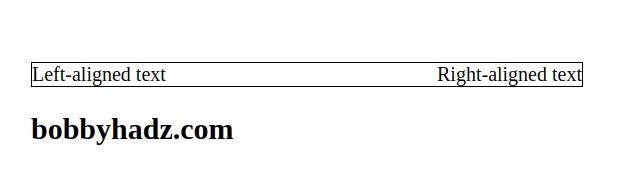
We set the margin-left CSS property on the element that has a class of right
to align it to the right.
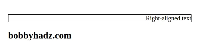
Here is an example where the parent div only contains 1 flex item with its
margin-left property set to auto.
<!DOCTYPE html> <html lang="en"> <head> <meta charset="UTF-8" /> <style> body { margin: 100px; } .box { display: flex; border: 1px solid black; } .right { margin-left: auto; } </style> </head> <body> <div class="box"> <div class="right">Right-aligned text</div> </div> <h2>bobbyhadz.com</h2> <script src="index.js"></script> </body> </html>
As noted in
this section
of the MDN docs, you can't use justify-self in flexbox because it justifies
all flex items as a group.
If you have two flex items that you need to align to the left and right, you can
also set the justify-content CSS property to space-between.
<!DOCTYPE html> <html lang="en"> <head> <meta charset="UTF-8" /> <style> body { margin: 100px; } .box { display: flex; border: 1px solid black; justify-content: space-between; } </style> </head> <body> <div class="box"> <div class="left">Left-aligned text</div> <div class="right">Right-aligned text</div> </div> <h2>bobbyhadz.com</h2> <script src="index.js"></script> </body> </html>
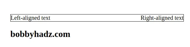
When the
justify-content
CSS property is set to space-between, the flex items are evenly distributed
within the container along the main axis.
The spacing between each pair of adjacent items is the same.
Let's look at a different example.
Here is the starting point.
<!DOCTYPE html> <html lang="en"> <head> <meta charset="UTF-8" /> <style> body { margin-top: 100px; } .box { display: flex; border: 1px solid black; } .right { margin-left: auto; } </style> </head> <body> <div class="box"> <p>First</p> <p>Second</p> <p>Third</p> <p class="right">Fourth</p> </div> <h2>bobbyhadz.com</h2> <script src="index.js"></script> </body> </html>
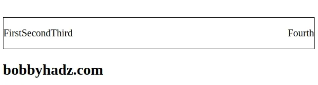
We set the margin-left CSS property on the past p element to auto to align
it to the right.
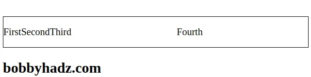
.right { margin-left: auto; margin-right: auto; }
If you also set the margin-right CSS property on the same element to auto,
you will center it in the remaining space.
Now suppose, we want to have the first p element aligned to the left, the next
two centered and the fourth p element aligned to the right.
<!DOCTYPE html> <html lang="en"> <head> <meta charset="UTF-8" /> <style> body { margin-top: 100px; } .box { display: flex; border: 1px solid black; } p { padding: 0px 5px; } .right { margin-left: auto; } </style> </head> <body> <div class="box"> <p>First</p> <p class="right">Second</p> <p>Third</p> <p class="right">Fourth</p> </div> <h2>bobbyhadz.com</h2> <script src="index.js"></script> </body> </html>
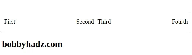
The only thing we had to change to center the middle two p elements in the
remaining space is to set the margin-left CSS property on the second p
element to auto.
<div class="box"> <p>First</p> <p class="right">Second</p> <p>Third</p> <p class="right">Fourth</p> </div>
And here is the right class.
.right { margin-left: auto; }
Now the first p element is aligned to the left, the second two are centered
and the last p element is aligned to the right.
Using this approach is responsive because we used auto margins and the empty space is distributed equally.
Half the left margin goes to the fourth p element and the other half goes to
the second p element.
# Conclusion
The justify-self CSS property has no effect when using flexbox.
However, the property works when you use grid or the display CSS property is
set to block.
# Additional Resources
You can learn more about the related topics by checking out the following tutorials:
- Change Select Option Background-Color on Hover in CSS/HTML
- Check if Element is Input or Select dropdown in JavaScript
- Change a Button's color onClick using JavaScript
- Change button text on Click using JavaScript
- How to Change Text color on Mouseover in JavaScript
- How to adjust a Button's width to fit the Text in CSS
- How to set a Max Character length in CSS
- Changing Bold Text into Normal (Unbold Text) in HTML
- How to bring an element to the Front using CSS
- Apply multiple inline CSS styles to an HTML element
- Force the text in a Div to stay in one Line in HTML & CSS