Force the text in a Div to stay in one Line in HTML & CSS
Last updated: Apr 5, 2024
Reading time·4 min
# Table of Contents
- Force the text in a Div to stay in one Line in HTML & CSS
- Displaying an ellipsis if the text overflows
- Force a single line of text to fill the width of a container using CSS
# Force the text in a Div to stay in one Line in HTML & CSS
To force the text in a div element to stay in one line using HTML and CSS:
- Set the element's
white-spaceCSS property tonowrapto suppress line breaks. - Set the
overflowCSS property tohiddento clip the remaining text.
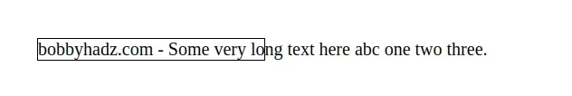
<!DOCTYPE html> <html lang="en"> <head> <meta charset="UTF-8" /> <style> #box { border: 1px solid black; width: 200px; white-space: nowrap; overflow: hidden; } </style> </head> <body> <div id="box"> bobbyhadz.com - Some very long text here abc one two three. </div> </body> </html>
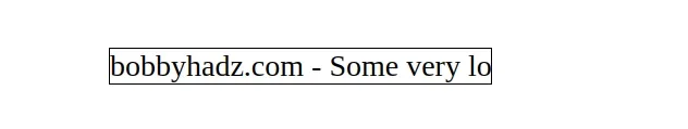
When the
white-space CSS
property is set to nowrap, white space is collapsed, however, line breaks are
suppressed.
#box { border: 1px solid black; width: 200px; white-space: nowrap; overflow: hidden; }
In other words, the nowrap value disables text wrapping within the source.
There is also a pre value of the white-space CSS property.
The pre value preserves the white space and only breaks lines at newline
characters and <br> elements in the source.
#box { border: 1px solid black; width: 200px; white-space: pre; overflow: hidden; }
When the overflow
CSS property is set to hidden, then the overflowing content is clipped at the
element's padding box.
There are no scroll bars and the clipped content is not visible.
If you don't set the overflow property to hidden, then the overflowing
characters would still get shown.
#box { border: 1px solid black; width: 200px; white-space: nowrap; /* 👇️ unset this property */ /* overflow: hidden; */ }
# Displaying an ellipsis if the text overflows
You could also set the text-overflow CSS property to ellipsis if you want
to add an ellipsis when the text overflows.
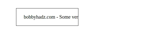
<!DOCTYPE html> <html lang="en"> <head> <meta charset="UTF-8" /> <style> #box { border: 1px solid black; width: 200px; white-space: nowrap; overflow: hidden; text-overflow: ellipsis; } </style> </head> <body> <div id="box"> bobbyhadz.com - Some very long text here abc one two three. </div> </body> </html>
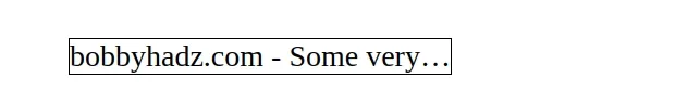
When the
text-overflow
CSS property is set to ellipsis, then an ellipsis ... is displayed to
represent the clipped text.
If you're working with a span element, make sure to set its display property
to inline-block or block for the width CSS property to take effect.
<!DOCTYPE html> <html lang="en"> <head> <meta charset="UTF-8" /> <style> #box { border: 1px solid black; width: 200px; display: inline-block; white-space: nowrap; overflow: hidden; text-overflow: ellipsis; } </style> </head> <body> <span id="box"> bobbyhadz.com - Some very long text here abc one two three. </span> </body> </html>
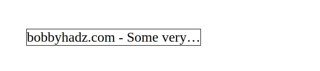
If you don't set the display property of a span to block or
inline-block, the width property won't work.
# Force a single line of text to fill the width of a container using CSS
If you need to force a single line of text to fill the width of a container:
- Set the
text-alignproperty on the element tojustify. - Use the
::afterpseudo-selector to create a pseudo-element. - Set the element's
displaytoinline-blockand its width to100%.
<!DOCTYPE html> <html lang="en"> <head> <meta charset="UTF-8" /> <style> #box { text-align: justify; width: 530px; border: 1px solid black; } #box::after { content: ''; display: inline-block; width: 100%; } </style> </head> <body> <div id="box">bobbyhadz.com - Some very wide text.</div> </body> </html>
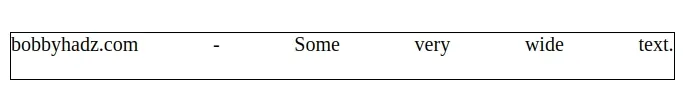
We first set the
text-align
property of the div element to justify.
#box { text-align: justify; width: 530px; border: 1px solid black; }
The justify value is used, the text is spaced to line up its left and right
edges to the left and right edges of the container, except for the last line.
The next step is to use the ::after pseudo-selector to create a pseudo-element that is the last child of the selected element.
#box::after { content: ''; display: inline-block; width: 100%; }
We used an empty string for the content of the pseudo-element and:
- Set its
displayCSS property toinline-blockto generate a block element box so we can set thewidthproperty. - Set the pseudo-element's
widthto100%to have it span the whole width.
Now the text in the div element is forced to fill the single line regardless of the width of the container.
# Additional Resources
You can learn more about the related topics by checking out the following tutorials:
- How to adjust a Button's width to fit the Text in CSS
- Change Select Option Background-Color on Hover in CSS/HTML
- Check if Element is Input or Select dropdown in JavaScript
- Change a Button's color onClick using JavaScript
- Change button text on Click using JavaScript
- How to Change Text color on Mouseover in JavaScript
- Add a class to the Clicked Element using JavaScript
- How to put an Input element on the same line as its Label
- How to fetch and display JSON data in HTML using JavaScript
- [DOM] Input elements should have autocomplete attributes
