How to create an Alert/Admonition Box in GitHub Markdown
Last updated: Apr 5, 2024
Reading time·4 min
# Table of Contents
- How to create an Alert/Admonition Box in GitHub Markdown
- Using emojis to create an admonition box in GitHub markdown
- Using a table to create an Alert/Admonition box in GitHub markdown
- Creating admonition boxes in GitHub markdown using images
# How to create an Alert/Admonition Box in GitHub Markdown
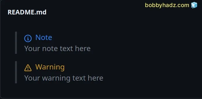
You can use a blockquote that follows specific rules to create an alert/admonition box in GitHub markdown.
The first line has to be exactly `> Noteor> Warning` and the second
line contains your text.
> **Note** Your note text here > **Warning** Your warning text here
Things to note:
- For now, only Note and Warning admonition boxes are supported.
- The first line must be exactly as shown in the code sample.
- The first letter is case-sensitive.
- Your custom text is added on the second line.
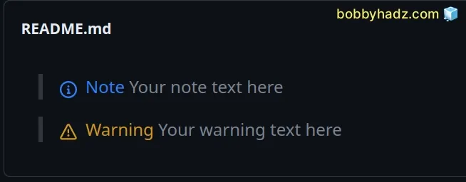
> **Note** Your note text here > **Warning** Your warning text here
I added two consecutive spaces at the end of the Note and Warning lines to
add a new line.
You can also use a br tag to add a newline character
> **Note**<br> Your note text here > **Warning**<br> Your warning text here

If you don't add a newline character, the Note and Warning text will appear on the same line as your custom text.
# Using emojis to create an admonition box in GitHub markdown
Emojis are commonly used to create admonition boxes in GitHub markdown.
Here are some examples.
> :warning: **This is a Warning**: Description text here > :memo: **This is a Note**: Description text here > :bulb: **This is a Hint**: Description text here > :heavy_check_mark: **Check**: Description text here > :information_source: **Additional Information**: Description text here
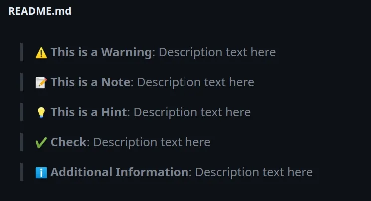
The example alerts use GitHub emojis. You can view all emojis from the list in this GitHub gist or this GitHub repo.
There are hundreds of emojis you can pick from.
You can also add a newline character after the first line.
> :warning: **This is a Warning**: <br> Description text here > :memo: **This is a Note**: <br> Description text here > :bulb: **This is a Hint**: <br> Description text here > :heavy_check_mark: **Check**: <br> Description text here > :information_source: **Additional Information**: <br> Description text here
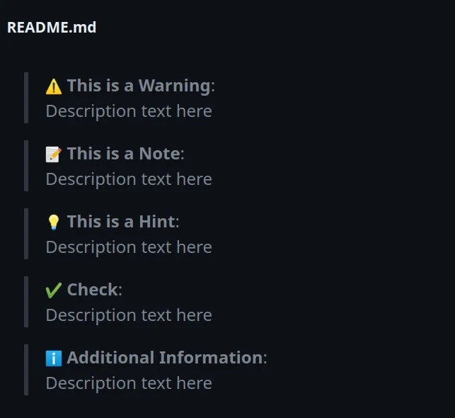
Alternatively, you can use universal emojis. There are Emoji apps that allow you to copy and paste emojis for all operating systems.
There are also many lists online that you can copy and paste from.
For example:
> ⚠️ **This is a Warning**: Description text here > 📝 **This is a Note**: Description text here > 💡 **This is a Hint**: Description text here > ✅ **Check**: Description text here > 🏆 **Check**: Description text here > ⛔️ **Error**: Description text here > ❌ **Error**: Description text here > ❗ **Attention**: Description text here > 🚧 **Attention**: Description text here
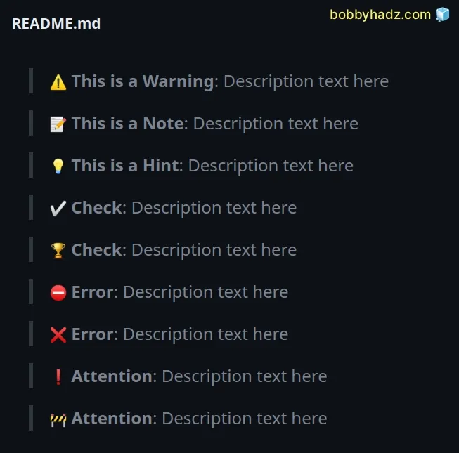
The emojis above are not specific to GitHub and can be used in admonition boxes in all markdown editors, e.g. plain or Jupyter Notebook.
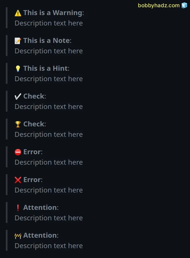
You can also add a newline character after the bolded text.
> ⚠️ **This is a Warning**: <br> Description text here > 📝 **This is a Note**: <br> Description text here > 💡 **This is a Hint**: <br> Description text here > ✅ **Check**: <br> Description text here > 🏆 **Check**: <br> Description text here > ⛔️ **Error**: <br> Description text here > ❌ **Error**: <br> Description text here > ❗ **Attention**: <br> Description text here > 🚧 **Attention**: <br> Description text here
I've also written an article on how to right-align, justify-align and center text in Markdown.
# Using a table to create an Alert/Admonition box in GitHub markdown
You can also use a table to create an admonition box that has a border around the text.
| WARNING: Some very long warning text here. ABC one two three. | | --- |

You can also use an emoji to draw the reader's attention.
| :warning: **Warning:** Some very long warning text here. | | --- |

You can also use HTML tags to make your code more readable.
<table> <td>:warning: <b>Warning:</b> Some warning text here.</td> </table>

# Creating admonition boxes in GitHub markdown using images
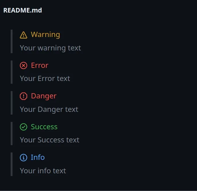
You can also follow the approach in this GitHub repository and use images to create GitHub admonition boxes.
> <picture> > <source media="(prefers-color-scheme: light)" srcset="https://raw.githubusercontent.com/Mqxx/GitHub-Markdown/main/blockquotes/badge/light-theme/warning.svg"> > <img alt="Warning" src="https://raw.githubusercontent.com/Mqxx/GitHub-Markdown/main/blockquotes/badge/dark-theme/warning.svg"> > </picture><br> > > Your warning text > <picture> > <source media="(prefers-color-scheme: light)" srcset="https://raw.githubusercontent.com/Mqxx/GitHub-Markdown/main/blockquotes/badge/light-theme/error.svg"> > <img alt="Error" src="https://raw.githubusercontent.com/Mqxx/GitHub-Markdown/main/blockquotes/badge/dark-theme/error.svg"> > </picture><br> > > Your Error text > <picture> > <source media="(prefers-color-scheme: light)" srcset="https://raw.githubusercontent.com/Mqxx/GitHub-Markdown/main/blockquotes/badge/light-theme/danger.svg"> > <img alt="Danger" src="https://raw.githubusercontent.com/Mqxx/GitHub-Markdown/main/blockquotes/badge/dark-theme/danger.svg"> > </picture><br> > > Your Danger text > <picture> > <source media="(prefers-color-scheme: light)" srcset="https://raw.githubusercontent.com/Mqxx/GitHub-Markdown/main/blockquotes/badge/light-theme/success.svg"> > <img alt="Success" src="https://raw.githubusercontent.com/Mqxx/GitHub-Markdown/main/blockquotes/badge/dark-theme/success.svg"> > </picture><br> > > Your Success text > <picture> > <source media="(prefers-color-scheme: light)" srcset="https://raw.githubusercontent.com/Mqxx/GitHub-Markdown/main/blockquotes/badge/light-theme/info.svg"> > <img alt="Info" src="https://raw.githubusercontent.com/Mqxx/GitHub-Markdown/main/blockquotes/badge/dark-theme/info.svg"> > </picture><br> > > Your info text
Check out this GitHub repository for more examples.
I've also written articles on:
- How to right-align, justify-align and center text in Markdown
- How to display Directory & File structure in Markdown Files
- Adding images and links to files in Markdown in VS Code
- How to add a new line in a Jupyter Notebook markdown cell
- How to change the color of specific Text in Markdown
- How to write Lists inside a Table in Markdown
- How to add a GIF to a Markdown file (Github and Vanilla)
- How to embed a Video into GitHub README.md (Markdown)
- How to edit the Title of an Alert box in JavaScript

