How to put an Input element on the same line as its Label
Last updated: Apr 5, 2024
Reading time·4 min
# How to put an Input element on the same line as its Label
To put an input element on the same line as its label:
- Wrap the input and label in a
divelement. - Set the
displayproperty on the wrapperdivtoflex. - Make sure the div's
flex-directionis set torow.
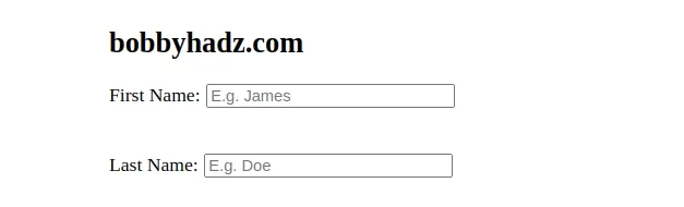
<!DOCTYPE html> <html lang="en"> <head> <meta charset="UTF-8" /> <style> .form-group { display: flex; flex-direction: row; justify-content: center; align-items: center; } label { padding-right: 5px; } </style> </head> <body> <h2>bobbyhadz.com</h2> <div class="form-group"> <label for="first-name">First Name:</label> <input id="first-name" name="first-name" placeholder="E.g. James" /> </div> <br /> <br /> <div class="form-group"> <label for="last-name">Last Name:</label> <input id="last-name" name="last-name" placeholder="E.g. Doe" /> </div> </body> </html>
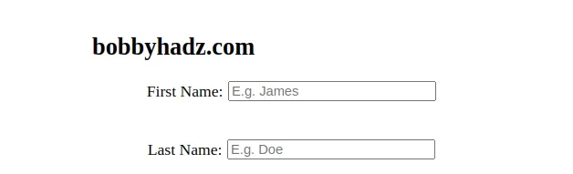
We wrapped each label and input into a div element.
<div class="form-group"> <label for="first-name">First Name:</label> <input id="first-name" name="first-name" placeholder="E.g. James" /> </div>
The wrapper div has a class of form-group.
Here are the CSS properties that are applied to the class.
.form-group { display: flex; flex-direction: row; justify-content: center; align-items: center; }
We set the display
property of the wrapper div to flex.
When the flex display value is in effect, the element behaves like a
block-level element and lays out its content according to the flexbox model.
When the
flex-direction
property is set to row, the flex container's main axis is defined to be the
same as the text direction.
This positions the label and input elements next to one another, on the same
line.
The justify-content and align-items CSS properties are optional.
When they are set to center, the div is centered horizontally and
vertically.
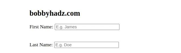
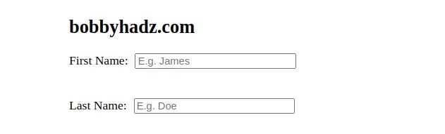
Here is an example that removes the two properties from the form-group class.
<!DOCTYPE html> <html lang="en"> <head> <meta charset="UTF-8" /> <style> .form-group { display: flex; flex-direction: row; } label { padding-right: 5px; } </style> </head> <body> <h2>bobbyhadz.com</h2> <div class="form-group"> <label for="first-name">First Name:</label> <input id="first-name" name="first-name" placeholder="E.g. James" /> </div> <br /> <br /> <div class="form-group"> <label for="last-name">Last Name:</label> <input id="last-name" name="last-name" placeholder="E.g. Doe" /> </div> </body> </html>
You can also use inline styles to set the display CSS property of the wrapper
div to flex.
<div class="form-group" style="display: flex; flex-direction: row;" > <label for="first-name">First Name:</label> <input id="first-name" name="first-name" placeholder="E.g. James" /> </div>
The example uses the style inline attribute to set the display property of
the div element to flex.
# Put an Input element on the same line as its Label using float
You can also use the float CSS property to put an input element on the asme
line as its label.
<!DOCTYPE html> <html lang="en"> <head> <meta charset="UTF-8" /> <style> .form-group label { float: left; padding-right: 5px; } </style> </head> <body> <h2>bobbyhadz.com</h2> <div class="form-group"> <label for="first-name">First Name:</label> <input id="first-name" name="first-name" placeholder="E.g. James" /> </div> <br /> <br /> <div class="form-group"> <label for="last-name">Last Name:</label> <input id="last-name" name="last-name" placeholder="E.g. Doe" /> </div> </body> </html>
The float CSS property places an element on the left or right side of its container.
We set the label's float property to left so the element floats on the left
side of its containing block.
However, you won't see the float CSS property used often in modern code
because it sometimes leads to confusion.
# Put an Input element on the same line as its Label using inline-block
You can also set the display CSS property of the label element to
inline-block to put it on the same line as the input element.
<!DOCTYPE html> <html lang="en"> <head> <meta charset="UTF-8" /> <style> .form-group input { display: inline-block; } .form-group label { display: inline-block; padding-right: 5px; } </style> </head> <body> <h2>bobbyhadz.com</h2> <div class="form-group"> <label for="first-name">First Name:</label> <input id="first-name" name="first-name" placeholder="E.g. James" /> </div> <br /> <br /> <div class="form-group"> <label for="last-name">Last Name:</label> <input id="last-name" name="last-name" placeholder="E.g. Doe" /> </div> </body> </html>
When the display property of an element is set to
inline-block,
it generates a block box that is flowed with surrounding content as if it were a
single inline box.
By default, the label element has its display property set to block, so
setting it to inline-block makes it so the label and the input are positioned
on the same line.
The block value of the display property means that a block box is generated
with line breaks before and after the element.
# Put an Input element on the same line as its Label using grid
You can also use the grid display value to put an input element on the same
line as its label.
<!DOCTYPE html> <html lang="en"> <head> <meta charset="UTF-8" /> <style> body { margin: 100px; } form { display: grid; gap: 20px; max-width: 300px; } .form-group { display: grid; gap: 4px; } @media (min-width: 500px) { form { max-width: 300px; } .form-group { grid-template-columns: 1fr 1fr; align-items: center; } .form-group label { white-space: nowrap; } } </style> </head> <body> <h2>bobbyhadz.com</h2> <form> <div class="form-group"> <label for="first-name">First Name:</label> <input id="first-name" name="first-name" placeholder="E.g. James" /> </div> <br /> <br /> <div class="form-group"> <label for="last-name">Last Name:</label> <input id="last-name" name="last-name" placeholder="E.g. Doe" /> </div> </form> </body> </html>
When the grid display value is set, the element behaves like a block-level element and lays out its content according to the grid model.
The @media CSS rules are applied when the visitor's screen is wider than
500px.
@media (min-width: 500px) { form { max-width: 300px; } .form-group { grid-template-columns: 1fr 1fr; align-items: center; } .form-group label { white-space: nowrap; } }
Make sure to adjust the max-width value of the form element depending on
your needs.
The grid-template-columns defines the line names and track sizing functions of the grid columns.
The grid-template-columns value in the example creates 2 columns - 1 for the
input and 1 for the label.
# Additional Resources
You can learn more about the related topics by checking out the following tutorials: