Tailwind CSS extending colors not working [Solutions]
Last updated: May 21, 2023
Reading time·4 min

# Tailwind CSS extending colors not working [Solutions]
One of the reasons you might not be able to extend your default colors in Tailwind CSS is that your custom colors might be getting purged.
You can add the custom colors to your safelist array in tailwind.config.js
to be sure that they aren't getting removed even if you haven't used them in
your source files.
/** @type {import('tailwindcss').Config} */ module.exports = { content: [ './pages/**/*.{html,js,jsx,ts,tsx}', './components/**/*.{html,js,jsx,ts,tsx}', ], theme: { extend: { colors: { transparent: 'transparent', current: 'currentColor', white: '#ffffff', purple: '#3f3cbb', midnight: '#121063', metal: '#565584', tahiti: '#3ab7bf', silver: '#ecebff', 'bubble-gum': '#ff77e9', bermuda: '#78dcca', }, }, }, plugins: [], safelist: [ { pattern: /(bg|text|border)-(transparent|current|white|purple|midnight|metal|tahiti|silver|bermuda)/, }, ], };
Notice that new colors are added to the theme.extend.colors property.
If you specify a color under theme.colors, you would be overriding the default
color.
The
safelist
property in your tailwind.config.js file enables you to specify dynamic class
names that won't get removed when your CSS is built.
The example above uses a pattern, however, you can also set the safelist
property to an array of strings with classes you want to keep.
module.exports = { content: [ './pages/**/*.{html,js,jsx,ts,tsx}', './components/**/*.{html,js,jsx,ts,tsx}', ], theme: { extend: { colors: { transparent: 'transparent', current: 'currentColor', white: '#ffffff', purple: '#3f3cbb', midnight: '#121063', metal: '#565584', tahiti: '#3ab7bf', silver: '#ecebff', 'bubble-gum': '#ff77e9', bermuda: '#78dcca', }, }, }, plugins: [], safelist: ['bg-current', 'bg-silver', 'bg-bermuda', 'text-silver'], };
By default, the colors will be made available everywhere in the Tailwind CSS framework where you use colors, e.g. in the text color, border color and background-color utilities.
<!DOCTYPE html> <html> <head> <meta charset="UTF-8" /> <meta name="viewport" content="width=device-width, initial-scale=1.0" /> <link href="output.css" rel="stylesheet" /> </head> <body> <h1 class="text-3xl bg-purple text-silver border-8 border-bermuda" > bobbyhadz.com </h1> </body> </html>
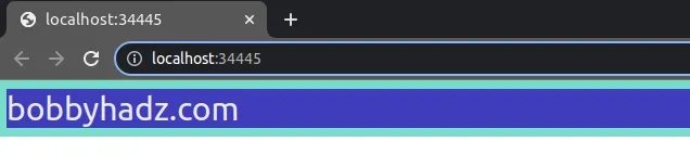
Notice that the custom color classes are applied correctly in the screenshot.
We used the following custom classes in the index.html file:
bg-purpletext-silverborder-bermuda
Notice that the names after the hyphen must correspond to the custom colors you
specified under theme.extend.colors.
/** @type {import('tailwindcss').Config} */ module.exports = { content: [ './pages/**/*.{html,js,jsx,ts,tsx}', './components/**/*.{html,js,jsx,ts,tsx}', ], theme: { extend: { colors: { transparent: 'transparent', current: 'currentColor', white: '#ffffff', purple: '#3f3cbb', midnight: '#121063', metal: '#565584', tahiti: '#3ab7bf', silver: '#ecebff', 'bubble-gum': '#ff77e9', bermuda: '#78dcca', }, }, }, plugins: [], safelist: [ { pattern: /(bg|text|border)-(transparent|current|white|purple|midnight|metal|tahiti|silver|bermuda)/, }, ], };
# Specifying multiple shades of the same color in an object
If you need to specify multiple shades of the same color, group them together using an object.
/** @type {import('tailwindcss').Config} */ module.exports = { content: ['./dist/**/*.{html,js}'], theme: { extend: { colors: { transparent: 'transparent', current: 'currentColor', white: '#ffffff', purple: '#3f3cbb', midnight: '#121063', metal: '#565584', tahiti: { 100: '#cffafe', 200: '#a5f3fc', 300: '#67e8f9', 400: '#22d3ee', 500: '#06b6d4', }, silver: '#ecebff', 'bubble-gum': '#ff77e9', bermuda: '#78dcca', }, }, }, plugins: [], safelist: [ { pattern: /(bg|text|border)-(transparent|current|white|purple|midnight|metal|tahiti|silver|bermuda)/, }, { pattern: /(bg|text|border)-(tahiti)-(100|200|300|400|500)/, }, ], };
notice that I also updated the safelist property to add the pattern that
matches the shades of the tahiti color.
Now I'll update my index.html file to use the new color.
<!DOCTYPE html> <html> <head> <meta charset="UTF-8" /> <meta name="viewport" content="width=device-width, initial-scale=1.0" /> <link href="output.css" rel="stylesheet" /> </head> <body> <h1 class="text-3xl bg-purple text-tahiti-100 border-8 border-silver" > bobbyhadz.com </h1> </body> </html>
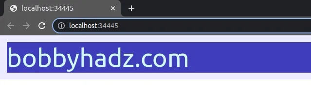
The text of the h1 element is set to the tahiti-100 color.
<h1 class="text-3xl bg-purple text-tahiti-100 border-8 border-silver" > bobbyhadz.com </h1>
You can also use colors such as bg-tahiti-200 or border-tahiti-300 to set
the background color of the element or its border color using the new custom
color.
# Specifying a default color using the DEFAULT property
If you want to specify a default color to be able to use the class as
bg-tahiti, then set the DEFAULT property in the tahiti object.
/** @type {import('tailwindcss').Config} */ module.exports = { content: ['./dist/**/*.{html,js}'], theme: { extend: { colors: { transparent: 'transparent', current: 'currentColor', white: '#ffffff', purple: '#3f3cbb', midnight: '#121063', metal: '#565584', tahiti: { // 👇️ set default property DEFAULT: '#ff9687', 100: '#cffafe', 200: '#a5f3fc', 300: '#67e8f9', 400: '#22d3ee', 500: '#06b6d4', }, silver: '#ecebff', 'bubble-gum': '#ff77e9', bermuda: '#78dcca', }, }, }, plugins: [], safelist: [ { pattern: /(bg|text|border)-(transparent|current|white|purple|midnight|metal|tahiti|silver|bermuda)/, }, { pattern: /(bg|text|border)-(tahiti)-(100|200|300|400|500)/, }, ], };
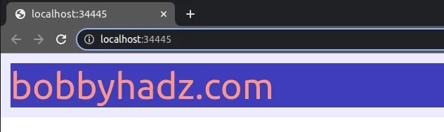
We set the DEFAULT property in the tahiti object, so the class can also be
used as bg-tahiti, text-tahiti and border-tahiti.
<h1 class="text-3xl bg-purple text-tahiti border-8 border-silver" > bobbyhadz.com </h1>
# Adding additional shades to an existing color
You can also add additional shades to an existing color under
theme.extend.colors.
module.exports = { theme: { extend: { colors: { red: { 950: '#8B0000', }, } }, }, }
Now you would use the color as bg-red-950, text-red-950 or border-red-950.
# Overriding an existing color
When you need to override the value of an existing color, set the property under
theme.colors.YOUR_COLOR.
For example, the following property overrides the value of blue-100.
module.exports = { theme: { colors: { blue: { 100: '#f0f402', }, } }, }
The next time you use bg-blue-100, text-blue-100 or border-blue-100, the
new color will be applied.
Notice that we didn't set the property under theme.extend.colors when
overriding an existing color.
Instead, we set the property under theme.colors.
I've also written an article on how to resolve the issue where your Tailwind CSS classes aren't working.
# Additional Resources
You can learn more about the related topics by checking out the following tutorials:
- Cannot find module 'tailwindcss' error [Solved]
- How to Change Text color on Mouseover in JavaScript
- Add a class to the Clicked Element using JavaScript
- Check if Element was Clicked using JavaScript
- Hide element when clicked outside using JavaScript
- Set min-margin, max-margin, min-padding & max-padding in CSS
- How to adjust a Button's width to fit the Text in CSS
