Annotate Bars in Barplot with Pandas and Matplotlib
Last updated: Apr 12, 2024
Reading time·4 min

# Table of Contents
- Annotate Bars in a single-group Bar chart with Pandas and Matplotlib
- Annotate Bars in a multi-group Bar chart with Pandas and Matplotlib
- Annotate Bars in a multi-group Bar chart with Pandas using Axes.patches
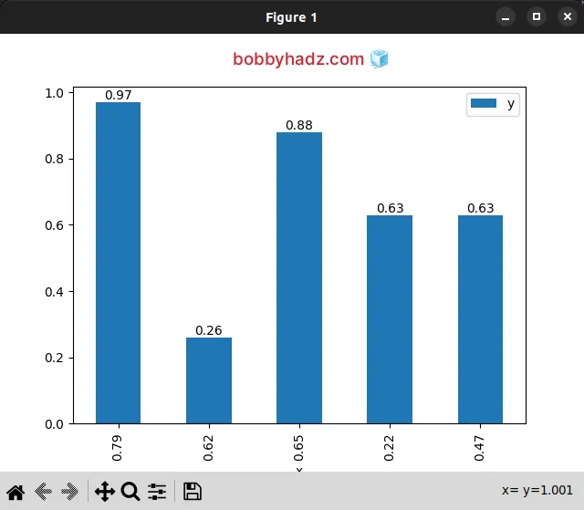
# Annotate Bars in a single-group Bar chart with Pandas and Matplotlib
To annotate bars in a single-group bar chart with Pandas and Matplotlib:
- Call the
Axes.bar_label()method to add labels to the bars in the bar container. - Pass the first
BarContainerobject as an argument to thebar_label()method.
import pandas as pd import matplotlib.pyplot as plt df = pd.DataFrame({ 'x': [0.79, 0.62, 0.65, 0.22, 0.47], 'y': [0.97, 0.26, 0.88, 0.63, 0.63], }, index=['A', 'B', 'C', 'D', 'E']) ax = df.plot.bar(x='x', y='y') ax.bar_label(ax.containers[0]) plt.show()
The Axes.bar_label() method adds labels to the bars in the supplied BarContainer.
The Axes.bar_label() method basically enables us to auto-label bar charts.
The only argument we passed to the method is the first artist in the
BarContainer object.
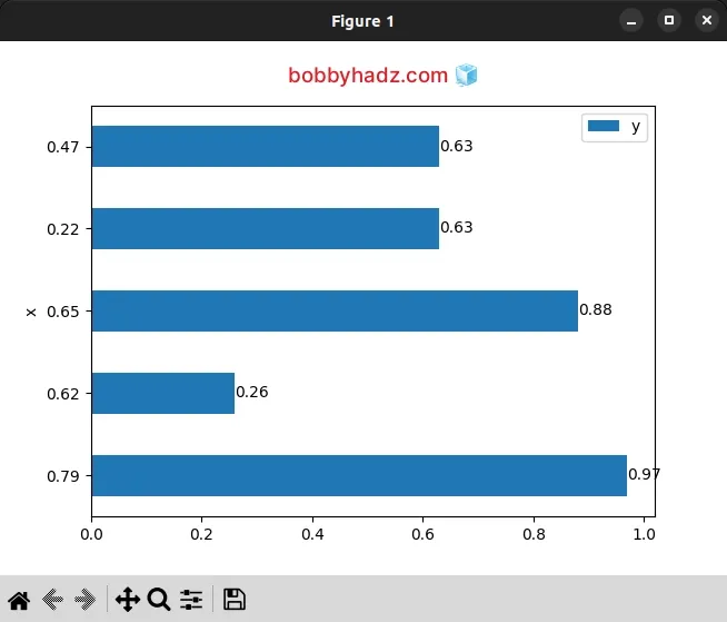
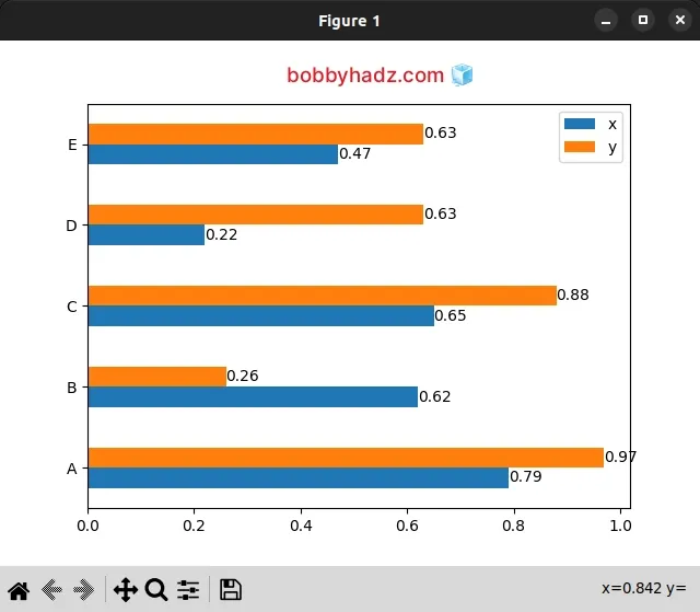
This approach also works if you have a horizontal bar plot.
import pandas as pd import matplotlib.pyplot as plt df = pd.DataFrame({ 'x': [0.79, 0.62, 0.65, 0.22, 0.47], 'y': [0.97, 0.26, 0.88, 0.63, 0.63], }, index=['A', 'B', 'C', 'D', 'E']) ax = df.plot.barh(x='x', y='y') ax.bar_label(ax.containers[0]) plt.show()
# Annotate Bars in a multi-group Bar chart with Pandas and Matplotlib
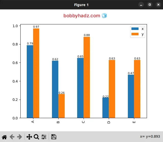
However, if you need to annotate bars in a multi-group bar chart, you have to
use a for loop to iterate over the
BarContainer objects and pass each container to axes.bar_label().
import pandas as pd import matplotlib.pyplot as plt df = pd.DataFrame({ 'x': [0.79, 0.62, 0.65, 0.22, 0.47], 'y': [0.97, 0.26, 0.88, 0.63, 0.63], }, index=['A', 'B', 'C', 'D', 'E']) ax = df.plot.bar() for container in ax.containers: ax.bar_label(container) plt.show()
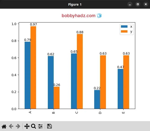
The ax.containers attribute returns a list containing the artists for the x
and y axes.
import pandas as pd import matplotlib.pyplot as plt df = pd.DataFrame({ 'x': [0.79, 0.62, 0.65, 0.22, 0.47], 'y': [0.97, 0.26, 0.88, 0.63, 0.63], }, index=['A', 'B', 'C', 'D', 'E']) ax = df.plot.bar() for container in ax.containers: ax.bar_label(container) # [<BarContainer object of 5 artists>, <BarContainer object of 5 artists>] print(ax.containers)
On each iteration of the for loop, we pass the current BarContainer to the
Axes.bar_label() method to label the bar plot.
You can also use the padding argument if you need to increase the distance to
the label from the end to the bar.
import pandas as pd import matplotlib.pyplot as plt df = pd.DataFrame({ 'x': [0.79, 0.62, 0.65, 0.22, 0.47], 'y': [0.97, 0.26, 0.88, 0.63, 0.63], }, index=['A', 'B', 'C', 'D', 'E']) ax = df.plot.bar() for container in ax.containers: ax.bar_label(container, padding=2, fontsize=8) plt.show()
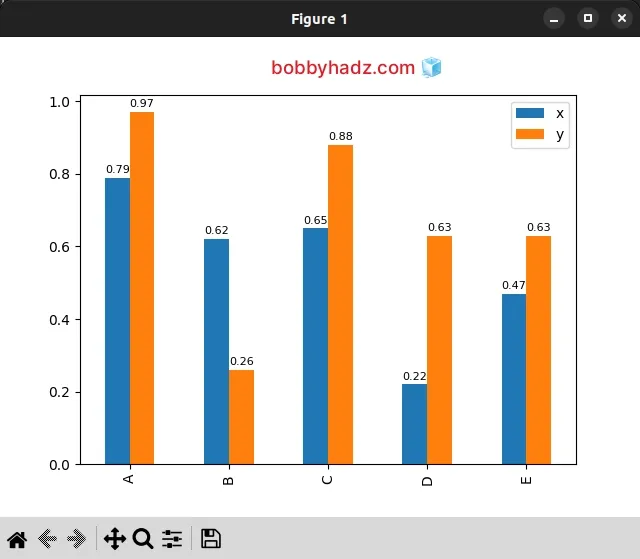
I also set the fontsize argument but you don't have to.
This approach also works for a multi-group horizontal bar plot.
import pandas as pd import matplotlib.pyplot as plt df = pd.DataFrame({ 'x': [0.79, 0.62, 0.65, 0.22, 0.47], 'y': [0.97, 0.26, 0.88, 0.63, 0.63], }, index=['A', 'B', 'C', 'D', 'E']) ax = df.plot.barh() for container in ax.containers: ax.bar_label(container) plt.show()
# Annotate Bars in a multi-group Bar chart with Pandas using Axes.patches
You can also use the patches property to annotate bars in a multi-group bar chart.
import pandas as pd import matplotlib.pyplot as plt df = pd.DataFrame({ 'x': [0.79, 0.62, 0.65, 0.22, 0.47], 'y': [0.97, 0.26, 0.88, 0.63, 0.63], }, index=['A', 'B', 'C', 'D', 'E']) ax = df.plot.bar() for patch in ax.patches: ax.annotate( str(patch.get_height()), (patch.get_x() * 1.000, patch.get_height() * 1.008), fontsize=8, ) plt.show()
Patches are Artists with a face color and an edge color.
import pandas as pd import matplotlib.pyplot as plt df = pd.DataFrame({ 'x': [0.79, 0.62, 0.65, 0.22, 0.47], 'y': [0.97, 0.26, 0.88, 0.63, 0.63], }, index=['A', 'B', 'C', 'D', 'E']) ax = df.plot.bar() # <Axes.ArtistList of 10 patches> print(ax.patches) for patch in ax.patches: ax.annotate( str(patch.get_height()), (patch.get_x() * 1.000, patch.get_height() * 1.008), fontsize=8, ) plt.show()
On each iteration of the for loop, we use the
Axes.annotate()
method to annotate the current bar.
You might have to adjust the multipliers in the second argument and the
fontsize depending on your needs.
The patch.get_height() method returns the height of the rectangle.
The patch.get_x() method returns the left coordinate of the rectangle.
I've also written a guide on how to annotate data points while plotting from a DataFrame in Pandas.
# Additional Resources
You can learn more about the related topics by checking out the following tutorials: