Show or hide another component on Click in React
Last updated: Apr 7, 2024
Reading time·7 min

# Table of Contents
- Show or hide another component on Click in React
- Show or hide another component on Click using the ternary operator
- Set CSS display: none conditionally in React
- Set CSS visibility: hidden conditionally in React
# Show or hide another component on Click in React
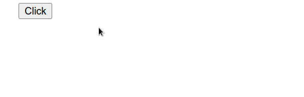
To show or hide another component on click in React:
- Set the
onClickprop on an element. - When the element is clicked, toggle a state variable that tracks if the component is shown.
- Conditionally render the component based on the state variable.
import {useState} from 'react'; export default function App() { const [isShown, setIsShown] = useState(false); const handleClick = event => { // 👇️ toggle shown state setIsShown(current => !current); // 👇️ or simply set it to true // setIsShown(true); }; return ( <div> <button onClick={handleClick}>Click</button> {/* 👇️ show elements on click */} {isShown && ( <div> <h2>Some content here</h2> </div> )} {/* 👇️ show component on click */} {isShown && <Box />} </div> ); } function Box() { return ( <div> <h2>Box</h2> </div> ); }
We used the useState hook to keep track of a boolean state variable that determines if the component should be shown or hidden.
const [isShown, setIsShown] = useState(false);
The hook returns an array containing a value and a function that is used to update the value.
onClick prop on the button element, so every time it is clicked, the handleClick function is invoked.const handleClick = event => { // 👇️ toggle shown state setIsShown(current => !current); };
In our handleClick function, we simply
toggle the isShown state variable.
Notice that we passed an initial value of false to the
useState hook because we want the
component to be hidden by default.
const [isShown, setIsShown] = useState(false);
We passed a function to setState because the function is guaranteed to be
invoked with the current (most up-to-date) state.
const handleClick = event => { // 👇️ toggle shown state setIsShown(current => !current); };
When the next state is computed using the previous state, pass a function to
setState.
The example toggles the state boolean every time the button is clicked.
If you only want to show the element, set the state variable to true.
const handleClick = event => { // 👇️ only show element on click setIsShown(true); };

When the setIsShown state variable is explicitly set to true, the other
component is shown no matter how many times we click on the button.
We used the logical AND (&&) operator to conditionally render the component based on the state variable.
<div> <button onClick={handleClick}>Click</button> {/* 👇️ show elements on click */} {isShown && ( <div> <h2>Some content here</h2> </div> )} {/* 👇️ show component on click */} {isShown && <Box />} </div>
The logical AND (&&) operator returns the value to the right if the value to the left is truthy.
We can use this approach because booleans, null and undefined are ignored. They simply don't render.
The following JSX expressions all render nothing.
<div /> <div></div> <div>{false}</div> <div>{null}</div> <div>{undefined}</div> <div>{true}</div>
I've also written a guide on how to show an element or text on hover.
# Show or hide another component on Click using the ternary operator
You could also use the ternary operator to show or hide another component on click.
import {useState} from 'react'; export default function App() { const [isShown, setIsShown] = useState(false); const handleClick = event => { // 👇️ toggle shown state setIsShown(current => !current); // 👇️ or simply set it to true // setIsShown(true); }; return ( <div> <button onClick={handleClick}>Click</button> {/* 👇️ show elements on click */} {isShown ? ( <div> <h2>bobbyhadz.com</h2> </div> ) : null} {/* 👇️ show component on click */} {isShown ? <Box /> : null} </div> ); } function Box() { return ( <div> <h2>Box</h2> </div> ); }
The ternary operator is
very similar to an if/else statement.
<div> <button onClick={handleClick}>Click</button> {/* 👇️ show elements on click */} {isShown ? ( <div> <h2>bobbyhadz.com</h2> </div> ) : null} {/* 👇️ show component on click */} {isShown ? <Box /> : null} </div>
If the isShown variable stores a true value, then the component is returned,
otherwise, null is returned.
You can imagine that the value before the colon is the if block and the value
after the colon is the else block.
Rendering a null value in your JSX code is equivalent to rendering nothing.
# Set CSS display: none conditionally in React
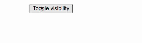
To set the CSS display property to none conditionally:
- Store a boolean in the state that indicates if the element should be shown.
- Conditionally set the
displayproperty in the element'sstyleprop.
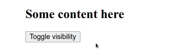
import {useState} from 'react'; export default function App() { const [isShown, setIsShown] = useState(true); const handleClick = event => { // 👇️ toggle visibility setIsShown(current => !current); }; return ( <div> <button onClick={handleClick}>Toggle visibility</button> <div style={{display: isShown ? 'block' : 'none'}}> <h2>Some content here</h2> </div> </div> ); }
We used the useState hook to store a boolean that indicates if an element should be shown or not.
Every time the button element is clicked, the isShown boolean is toggled, but
this could be triggered in any other way.
setIsShown. This is important, because the function we passed to setIsShown is guaranteed to be invoked with the current (most up-to-date) value of the isShown boolean.If the new state is computed
using the previous state,
you can pass a function to setState().
The display property of the style prop of the div element is
conditionally set using a
ternary operator.
The ternary operator is very similar to an if/else statement.
If the value to the left of the question mark is truthy, the operator returns the value to the left of the colon, otherwise the value to the right of the colon is returned.
const result1 = 5 === 5 ? 'yes' : 'no'; console.log(result1); // 👉️ "yes" const result2 = 5 === 10 ? 'yes' : 'no'; console.log(result2); // 👉️ "no"
If the isShown state variable stores a truthy value, we set the display
property to block. Otherwise, it's set to none.
# Set CSS display: none conditionally using classes
The same approach can also be used if you rely on setting class names for your styling.
import {useState} from 'react'; // 👇️ import css file import './App.css'; export default function App() { const [isShown, setIsShown] = useState(true); const handleClick = event => { setIsShown(current => !current); }; // 👇️ using classes return ( <div> <button onClick={handleClick}>Toggle visibility</button> <div className={isShown ? 'display-block' : 'display-none'}> <h2>Some content here</h2> </div> </div> ); }
And here is the css that defines the display-block and display-none
classes.
.display-block { display: block; } .display-none { display: none; }
The code snippet achieves the same result using classes instead of the style
prop.
If the element you are setting the class on has different classes as well, use a template string.
import {useState} from 'react'; import './App.css'; export default function App() { const [isShown, setIsShown] = useState(true); const handleClick = event => { // 👇️ toggle visibility setIsShown(current => !current); }; return ( <div> <button onClick={handleClick}>Toggle visibility</button> <div className={`my-class ${isShown ? 'display-block' : 'display-none'}`}> <h2>Some content here</h2> </div> </div> ); }
The dollar sign curly braces syntax enables us to evaluate an expression directly in the template string.
I've written a detailed guide on how to add or remove a class on click.
Set CSS visibility: hidden conditionally in React
To set the CSS visibility property to hidden:
- Store a boolean in the state that indicates if the element should be visible.
- Conditionally set the
visibilityproperty in the element'sstyleprop.
import {useState} from 'react'; export default function App() { const [isVisible, setIsVisible] = useState(true); const handleClick = event => { // 👇️ toggle visibility setIsVisible(current => !current); }; return ( <div> <div style={{visibility: isVisible ? 'visible' : 'hidden'}}> <h2>Some content here</h2> </div> <button onClick={handleClick}>Toggle visibility</button> </div> ); }
We used the useState hook to store a boolean that indicates if an element should be visible or not.
Every time the button element is clicked, the isVisible
boolean is toggled, but this could be
triggered in any other way.
setIsVisible. This is important because the function we passed to setIsVisible is guaranteed to be invoked with the current (most up-to-date) value of the isVisible boolean.If the new state is computed
using the previous state,
you can pass a function to setState().
The visibility
property of the style prop of the div element is conditionally set using a
ternary operator.
The ternary operator is very similar to an if/else statement.
If the value to the left of the question mark is truthy, the operator returns the value to the left of the colon, otherwise the value to the right of the colon is returned.
const result1 = 5 === 5 ? 'yes' : 'no'; console.log(result1); // 👉️ "yes" const result2 = 5 === 10 ? 'yes' : 'no'; console.log(result2); // 👉️ "no"
If the isVisible state variable stores a truthy value, we set the visibility
property to visible. Otherwise, it's set to hidden.
Set CSS visibility: hidden conditionally using classes
The same approach can also be used if you rely on setting class names for your styling.
import {useState} from 'react'; // 👇️ import css file import './App.css'; export default function App() { const [isVisible, setIsVisible] = useState(true); const handleClick = event => { // 👇️ toggle visibility setIsVisible(current => !current); }; return ( <div> <div className={isVisible ? 'visible' : 'hidden'}> <h2>Some content here</h2> </div> <button onClick={handleClick}>Toggle visibility</button> </div> ); }
And here is the css that defines the visible and hidden classes.
.visible { visibility: visible; } .hidden { visibility: hidden; }
The code snippet above achieves the same result using classes instead of the
style prop.
If the element you are setting the class on has different classes as well, use a template string.
import {useState} from 'react'; // 👇️ import css file import './App.css'; export default function App() { const [isVisible, setIsVisible] = useState(true); const handleClick = event => { // 👇️ toggle visibility setIsVisible(current => !current); }; return ( <div> <div className={`my-class ${isVisible ? 'visible' : 'hidden'}`}> <h2>Some content here</h2> </div> <button onClick={handleClick}>Toggle visibility</button> </div> ); }
The dollar sign curly braces syntax enables us to evaluate an expression directly in the template string.