Matplotlib: How to add an Average Line to a Plot
Last updated: Apr 13, 2024
Reading time·3 min

# Table of Contents
- Matplotlib: How to add an Average Line to a Plot
- Matplotlib: Adding a vertical line to denote the mean
- Matplotlib: Adding an Average Line to a Plot with a second axes.plot() call
# Matplotlib: How to add an Average Line to a Plot
Use the pyplot.axhline() method to add an average line to a Plot in
Matplotlib.
The method takes the y position in data coordinates as a parameter.
import numpy as np import matplotlib.pyplot as plt x = np.linspace(0, 4*np.pi, 150) y = np.sin(x) ax = plt.subplot(111) ax.plot(x, y, label='Data') # ✅ Add an average line to a plot plt.axhline( np.mean(y), color='r', linestyle='-', linewidth=2, label='Mean' ) legend = ax.legend(loc='upper right') plt.show()
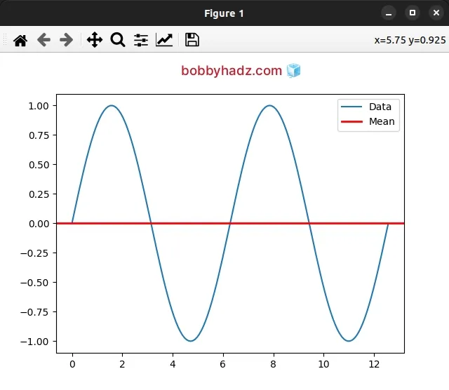
We called the pyplot.axhline() method with the result of calling numpy.mean().
# ✅ Add an average line to a plot plt.axhline( np.mean(y), color='r', linestyle='-', linewidth=2, label='Mean' )
All other arguments in the call to pyplot.axhline() are optional.
The pyplot.axhline() method adds a horizontal line across the axes.
The only argument that is required is y - the y position in data coordinates
of the horizontal line.
We used the numpy.mean() method to compute the arithmetic mean along the y
axis.
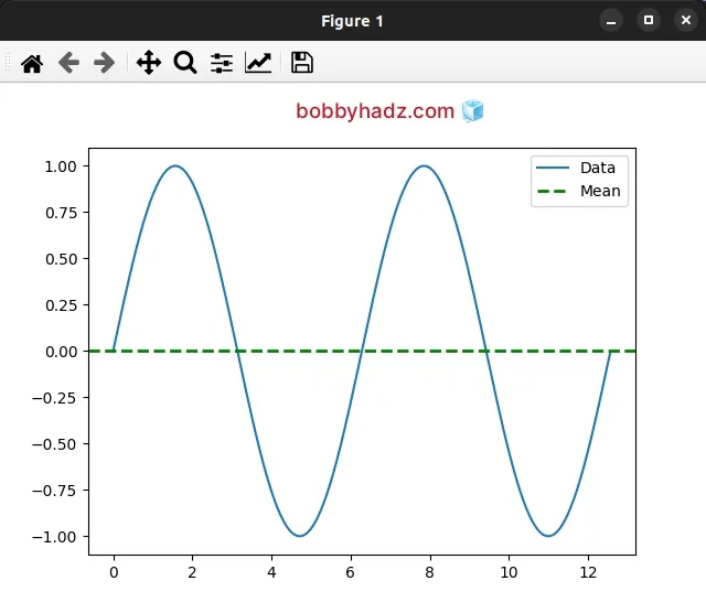
The pyplot.axhline() method takes many optional parameters that you can
specify to adjust the styling of the average line.
import numpy as np import matplotlib.pyplot as plt x = np.linspace(0, 4*np.pi, 150) y = np.sin(x) ax = plt.subplot(111) ax.plot(x, y, label='Data') plt.axhline( np.mean(y), color='g', linestyle='--', linewidth=2, label='Mean' ) legend = ax.legend(loc='upper right') plt.show()
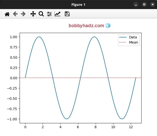
You can view all of the available parameters the pyplot.axhline() method takes
in the
"Other Parameters"
section.
import numpy as np import matplotlib.pyplot as plt x = np.linspace(0, 4*np.pi, 150) y = np.sin(x) ax = plt.subplot(111) ax.plot(x, y, label='Data') print(np.mean(y)) plt.axhline( np.mean(y), color='r', linestyle=':', linewidth=1.5, label='Mean', ) legend = ax.legend(loc='upper right') plt.show()
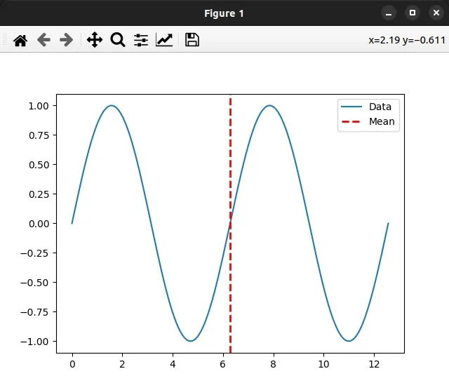
# Matplotlib: Adding a vertical line to denote the mean
If you need to add a vertical line to denote the mean, use the pyplot.axvline() method.
import numpy as np import matplotlib.pyplot as plt x = np.linspace(0, 4*np.pi, 150) y = np.sin(x) ax = plt.subplot(111) ax.plot(x, y, label='Data') print(np.mean(y)) plt.axvline( np.mean(x), color='red', linestyle='-', linewidth=2, label='Mean', ) legend = ax.legend(loc='upper right') plt.show()
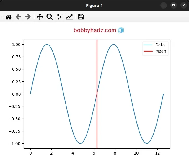
The pyplot.axvline() method adds a vertical line across the axes.
The only required argument we passed to axvline() is x - the x position in
data coordinates of the vertical line.
You can adjust the way the vertical line looks by supplying some of the optional parameters the method takes.
import numpy as np import matplotlib.pyplot as plt x = np.linspace(0, 4*np.pi, 150) y = np.sin(x) ax = plt.subplot(111) ax.plot(x, y, label='Data') print(np.mean(y)) plt.axvline( np.mean(x), color='red', linestyle='--', linewidth=2, label='Mean', ) legend = ax.legend(loc='upper right') plt.show()
You can view all of the parameters the axvline() method takes in the
Other Parameters
section.
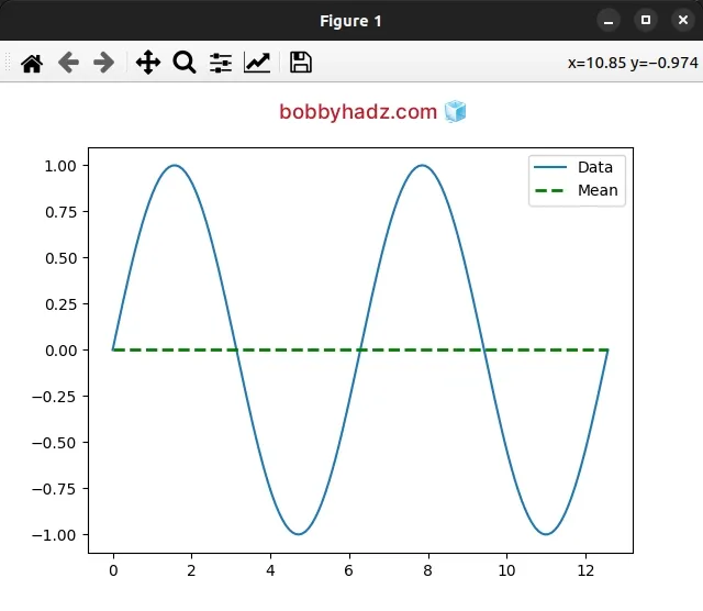
# Matplotlib: Adding an Average Line to a Plot with a second axes.plot() call
You can also add an average line to a plot with a second axes.plot() call.
import numpy as np import matplotlib.pyplot as plt x = np.linspace(0, 4*np.pi, 150) y = np.sin(x) ax = plt.subplot(111) ax.plot(x, y, label='Data') # ✅ 1) Calculate the mean of `y` y_mean = [np.mean(y)] * len(x) # ✅ 2) Plot the average line mean_line = ax.plot( x, y_mean, label='Mean', linestyle='-', color='red' ) legend = ax.legend(loc='upper right') plt.show()
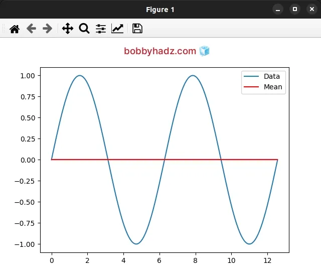
We first calculate the mean of y and then pass the x and y_mean variables
to axes.plot().
You can adjust how the average line looks by passing different parameters to the
axes.plot() method.
import numpy as np import matplotlib.pyplot as plt x = np.linspace(0, 4*np.pi, 150) y = np.sin(x) ax = plt.subplot(111) ax.plot(x, y, label='Data') # ✅ 1) Calculate the mean of `y` y_mean = [np.mean(y)] * len(x) # ✅ 2)️ Plot the average line mean_line = ax.plot( x, y_mean, label='Mean', linestyle='--', color='green', linewidth=2, ) legend = ax.legend(loc='upper right') plt.show()
You can view all of the available arguments the axes.plot() method takes in
the
Other Parameters
section in the docs.
# Additional Resources
You can learn more about the related topics by checking out the following tutorials: