Mark input field as required using asterisk * in HTML & CSS
Last updated: Apr 5, 2024
Reading time·5 min

# Table of Contents
- Mark input field as required using asterisk * in HTML & CSS
- Placing the asterisk inside the input field
- Placing the asterisk inside the input field using the
requiredattribute - The
requiredattribute is used for client-side validation - Using a simple approach to mark each field as required with an asterisk
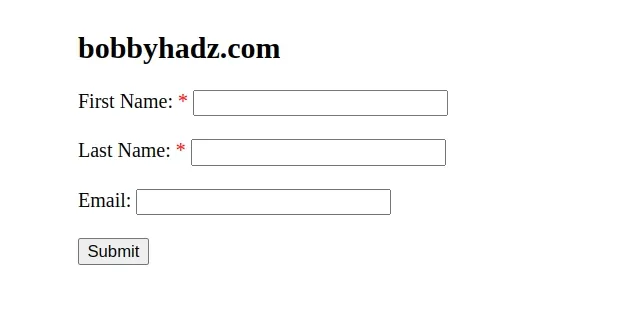
# Mark input field as required using asterisk * in HTML & CSS
Use ::after to create a pseudo-element containing an asterisk * to mark
one or more input fields as required with an asterisk in HTML and CSS.
::after can be used to add an asterisk * after the label text of each
input to indicate that the field is required.
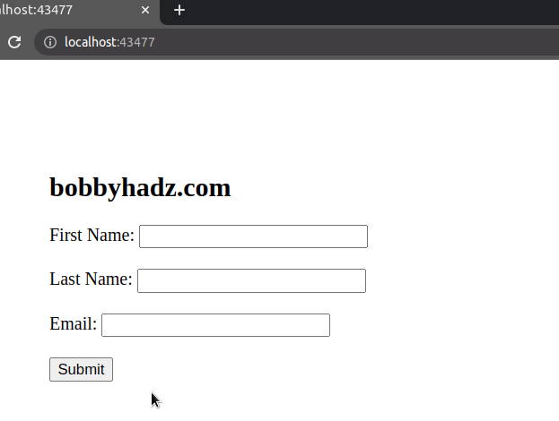
Here is the HTML for the example.
<!DOCTYPE html> <html lang="en"> <head> <meta charset="UTF-8" /> <style> body { margin: 100px; } .required::after { content: ' *'; color: red; } </style> </head> <body> <h2>bobbyhadz.com</h2> <form> <label class="required">First Name:</label> <input type="text" id="first" name="first" /> <br /> <br /> <label class="required">Last Name:</label> <input type="text" id="last" name="last" /> <br /> <br /> <label>Email:</label> <input type="email" id="email" name="email" /> <br /> <br /> <button type="submit">Submit</button> </form> </body> </html>
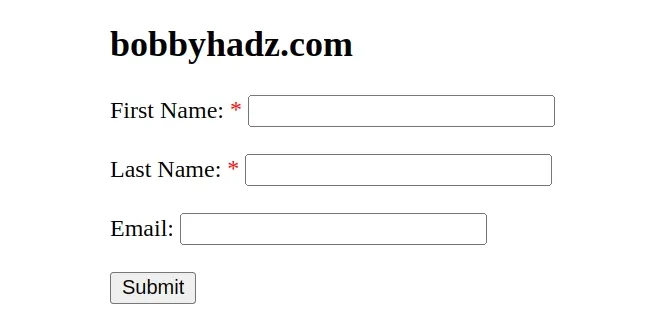
Notice that we set the required class on the first two label elements.
<label class="required">First Name:</label> <input type="text" id="first" name="first" /> <br /> <br /> <label class="required">Last Name:</label> <input type="text" id="last" name="last" />
We then used after:: to create a pseudo-element that consists of an asterisk.
.required::after { content: ' *'; color: red; }
The content property is used to set the content of the pseudo-element.
We also set its color to red to indicate that the field is required.
You can also set the font-size CSS property if you need to make the asterisk
symbols larger/smaller.
.required::after { content: ' *'; color: red; font-size: 20px; }
If the asterisk appears on a separate line, set its display CSS property to
inline.
.required::after { content: ' *'; color: red; display: inline; }
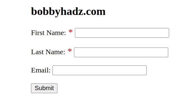
# Placing the asterisk inside the input field
In some cases, you might want to place the asterisks that indicate that a field is required inside the field itself.
Here is the code for the example.
<!DOCTYPE html> <html lang="en"> <head> <meta charset="UTF-8" /> <style> .asterisk_required_field::after { content: ' *'; color: red; position: absolute; margin: 2px 0px 0px -18px; font-size: 20px; padding: 0 5px 0 0; } </style> </head> <body> <h2>bobbyhadz.com</h2> <form> <label>First Name:</label> <input type="text" id="first" name="first" /> <span class="asterisk_required_field"></span> <br /> <br /> <label>Last Name:</label> <input type="text" id="last" name="last" /> <span class="asterisk_required_field"></span> <br /> <br /> <label>Email:</label> <input type="email" id="email" name="email" /> <br /> <br /> <button type="submit">Submit</button> </form> </body> </html>
We used the same approach.
However, this time we added a span element after each required input field.
<label>First Name:</label> <input type="text" id="first" name="first" /> <span class="asterisk_required_field"></span> <br /> <br /> <label>Last Name:</label> <input type="text" id="last" name="last" /> <span class="asterisk_required_field"></span>
The last step is to style the span element using ::after.
.asterisk_required_field::after { content: ' *'; color: red; position: absolute; margin: 2px 0px 0px -18px; font-size: 20px; padding: 0 5px 0 0; }
We set the position of the pseudo-element to absolute and used a negative
margin to move the asterisk to the left, inside the input field.
You might have to play around with the margin, font-size and padding
values if your input fields are larger.
# Placing the asterisk inside the input field using the required attribute
You can also use the required attribute to add an asterisk to each required
input field.
<!DOCTYPE html> <html lang="en"> <head> <meta charset="UTF-8" /> <style> input[required] { background-image: radial-gradient( red 25%, transparent 26% ), radial-gradient(red 25%, transparent 26%); background-size: 1.2em 1.2em; background-position: right top; background-repeat: no-repeat; } </style> </head> <body> <h2>bobbyhadz.com</h2> <form> <label>First Name:</label> <input required type="text" id="first" name="first" /> <br /> <br /> <label>Last Name:</label> <input required type="text" id="last" name="last" /> <br /> <br /> <label>Email:</label> <input type="email" id="email" name="email" /> <br /> <br /> <button type="submit">Submit</button> </form> </body> </html>
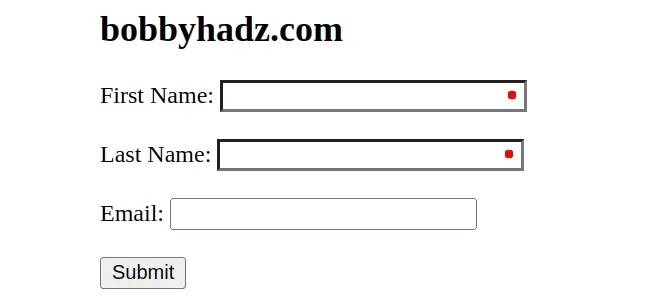
Notice that we set the required attribute on the two required input fields.
<label>First Name:</label> <input required type="text" id="first" name="first" /> <br /> <br /> <label>Last Name:</label> <input required type="text" id="last" name="last" />
The attribute is then used to style the fields.
input[required] { background-image: radial-gradient( red 25%, transparent 26% ), radial-gradient(red 25%, transparent 26%); background-size: 1.2em 1.2em; background-position: right top; background-repeat: no-repeat; }
You might have to play around with the percentages and the background-size
value depending on the size of your input fields.
# The required attribute is used for client-side validation
The required attribute is used for client-side validation.
If you need to display a helpful message when the user tries to submit the form without filling required fields, set the attribute on the required fields.
<!DOCTYPE html> <html lang="en"> <head> <meta charset="UTF-8" /> </head> <body> <h2>bobbyhadz.com</h2> <form> <label>First Name:</label> <input required type="text" id="first" name="first" /> <br /> <br /> <label>Last Name:</label> <input required type="text" id="last" name="last" /> <br /> <br /> <label>Email:</label> <input type="email" id="email" name="email" /> <br /> <br /> <button type="submit">Submit</button> </form> </body> </html>
We set the required attribute on the first two input fields.
<label>First Name:</label> <input required type="text" id="first" name="first" /> <br /> <br /> <label>Last Name:</label> <input required type="text" id="last" name="last" />
When the required attribute is set on an input element, then a "Please fill
out this field" message is displayed if the user tries to submit the form
without filling out the field.
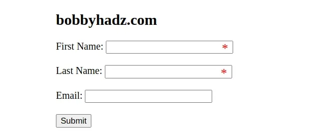
# Using a simple approach to mark each field as required with an asterisk
Here is an example that uses a very simple approach to mark each field as required with an asterisk.
<!DOCTYPE html> <html lang="en"> <head> <meta charset="UTF-8" /> </head> <body> <h2>bobbyhadz.com</h2> <form> <label >First Name: <span style="color: red">*</span></label > <input type="text" id="first" name="first" /> <br /> <br /> <label>Last Name: <span style="color: red">*</span></label> <input type="text" id="last" name="last" /> <br /> <br /> <label>Email:</label> <input type="email" id="email" name="email" /> <br /> <br /> <button type="submit">Submit</button> </form> </body> </html>
This time, we used a span element to add an asterisk to the required input fields.
<label >First Name: <span style="color: red">*</span></label > <input type="text" id="first" name="first" /> <br /> <br /> <label>Last Name: <span style="color: red">*</span></label> <input type="text" id="last" name="last" />
Each span has an asterisk * as its content.
You can optionally set inline styles on the span element.
The example sets the color CSS property of each asterisk to red.
# Additional Resources
You can learn more about the related topics by checking out the following tutorials:
